
Once again, we’ve reached a day full of equal parts anticipation and dread: alternate uniform reveal day. In a twist, Nebraska will wear their new duds on the road: September 24th at Northwestern.*
*I’m not sure why Northwestern is becoming the NU Uniform Bowl, with Nebraska wearing all black in 2015, and Northwestern wearing all black in 2014. The good news is, the team in white tends to win the game.
As is our custom, let’s break it down piece by piece.
Helmet:

As heavily (and rightfully) criticized as adidas has been for their previous attempts at alternate uniforms for NU, they usually do their best design work on the helmet. Adidas has found a good groove with maintaining Nebraska’s signature sans-serif “N”, but surrounding it with some trendy elements. The lone dud was the 2013 version with the thick black stripe and facemask that went from black to red.
This year is no different. At first glance, it reminds you of the late 1970’s when Nebraska wore grey facemasks – the only thing missing is the traditional red stripe down the middle. But on closer inspection, you see the “keeping up with the Joneses” touches: a matte helmet, a chrome facemask, and the “N” rendered in a metallic red instead of the standard red helmet tape. With a list like that, you might think they overdid it, but it works. Oh boy, do these work. I guarantee there will be calls from Husker fans to make this the permanent helmet.
I have a couple of minor nit-picks: For the numbers on the back of the helmet, I much prefer the current font over the block numerals. I’m okay with the idea of putting Herbie Husker on the front helmet bumper, but I don’t care for this version of him. I’d propose giving the defensive players a Blackshirts logo instead. But any quibbles I have are easily erased by the state decal on the back of the helmet. That is a keeper.

Grade: A
Jersey:

Last year, I took issue with how the uniforms seemed to be more of a showcase for adidas and their “high performance” gear than a unique expression of Nebraska Football. I closed by saying “Just simplify the look. Lose the tire treads, the reflective numbers, the stripes that look like they survived an attack from Freddy Krueger, and you’d really have something nice.”
And for the most part, adidas listened. Yes, the sublimated tire treads are still there, but they are much less pronounced than past years. The shoulder stripes still have diagonal slits, but it works here. I’ll get to the numbers in a second, but overall, this is a nice jersey. It combines classic and modern better than any alternate Nebraska has ever worn. That is a giant step forward for adidas.
However…
I have two complaints about the jerseys:
1. The shiny, reflective numbers. We’ve progressed away from the duct tape numbers, but take a look at the picture below. Even in the studio, there is rather significant glare on the top part of the jersey. Maybe it’s my aging eyes, but on a quick glance, that 16 looks a lot like an 18. Frankly, this won’t be as big of an issue for me as it has been in the past – only because I’m unable to make the trip to Evanston. I’m hopeful that the numbers will be moderately legible on TV, but if past history is any indication, my sympathies for anybody in the stadium.

2. Take another look at the picture above. Pretend you aren’t reading this on a Nebraska site, and tell me what team this uniform belongs to. Maybe you base your guess off of the red numbers and multiple adidas logos (Louisville? NC State? Northern Illinois? Mississippi State? Troy?) or the B1G logo (Ohio State, Wisconsin, and Rutgers all wear red). If you happen to know which Big Ten schools currently wear adidas, you could narrow it down to Nebraska or Indiana (Wisconsin is now with Under Armour). But from there, you’d either need to zoom in to the Herbie on the helmet bumper or flip a coin. Would it have ruined the look to add the “A Winning Tradition” patch? Personally, I don’t think so.
Even with those two beefs, this is easily adidas’s best work to date.
Grade: B
Pants

As much as I crack on adidas, I really should give them credit for simplifying my job here. Why? Because for the third straight year, I can recycle the same comment on the major design element on the pants: “Putting an “N” in the stripe is interesting. I don’t hate it, but I don’t love it either.” The way I see it, if they don’t have to come up with something original, neither should I.
Snark aside, I think the “N” works here. The diagonal slashes through the “N” and the stripes are unnecessary, but I can deal with them.
This is a good place to address the monochromatic white look. As a traditionalist, I love the road white jerseys matched up with the red pants. It is a beautiful look. As a moderately superstitious fan, I get the angst over Nebraska wearing “surrender whites” on the road. I don’t have the numbers in front of me, but I believe NU has a losing record in all white. Yes, those numbers are tainted by the 2002 and 2015 teams who probably would have lost no matter what color pants they wore, but some folks out there still don’t care for the all-white look.
To those people, let me say this: I hear you. I am one of you. I believe the Unicameral should pass a law requiring red pants on the road – even though said law would be impossible to enforce due to every infraction occurring outside of their jurisdiction. But this look, when taken as a whole works. Red pants with this ensemble wouldn’t work as well.
Grade: B+
Accessories

Compared to other years, the reveal video and Glamour Shots of the flexing model are rather light on images of the accessories. But what I see I really like. Instead of socks with a weird print or pattern – the ones that look cool on a receiver or defensive back, but ridiculous on a lineman – our model has opted for a basic pair of white socks. The cleats are equally clean and simple.
As part of their ongoing efforts to reduce, reuse, and recycle, adidas once again has the undershirt with a gigantic “N” on it. If you’d like to read snarky comments about that, feel free to go back to any of my other reviews. I do find it interesting that I have never seen one of those shirts of sale in any of the Husker shops around Lincoln.
The fact that I only needed to allocate a couple of sentences to accessories is another win.
Grade: A
Overall

Let’s start this final section by indulging me in one more quote from last year: “In my opinion, this helmet represents what a Nebraska alternate uniform should strive to be: different, yet recognizable. Trendy, yet classic.” For the first four years of the alternate uniform era, adidas has failed to take that idea past the helmet. The result has been a cookie cutter template that is more about adidas and their latest ‘innovation’ than it is about Nebraska. For a school of Nebraska’s stature, getting the same treatment as every other adidas school should be taken as an insult.
With that in mind, let’s take a minute and address the thematic inspiration for the “Husker Chrome” alts. According to the press release / marketing materials, these uniforms are “inspired by the city of Lincoln, Nebraska, also know as the ‘Star City'”. Remember that picture of the back of the helmet? I hope you noticed how the “player numbers featured in metallic red and metallic chrome outlining on the back of the helmet, showcas(es) the Star City’s ability to shine.”
No? You didn’t get that? Me neither.
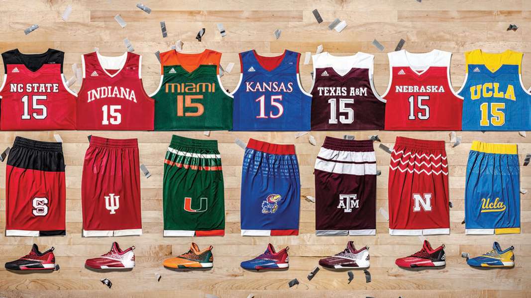
Despite that underdeveloped – if not complete reach – of a theme, adidas has done good work here. Unlike the last few years, I was cautiously optimistic about what we would see this year. Adidas has produced a number of alternate uniforms for the Nebraska Basketball team that are absolutely beautiful.* It’s clear that they’ve brought that same talent over to the football side of the house.
*With the obvious exception of the annual train wreck that is the adidas postseason templates. Yikes.
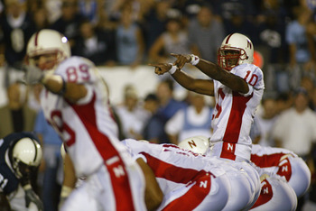
But most importantly is this line in the press release: “the new Husker Chrome alternate uniform blends crisp, modernized design with a tribute to Nebraska’s clean, classic signature look.” Finally, adidas seems to get that gaudy designs won’t play here. Superhero costumes that barely resemble Nebraska Football don’t work here. Numbers that are impossible to read are a failure to the 90,000 passionate fans that show up here. Seriously, take a look at this picture of I.M. Hipp and tell me you can’t see some of the design inspiration:

I’ll gladly listen to any cynics who want to (rightfully) point out that NU’s athletic apparel contract is coming up for renewal soon, and this is the uniform equivalent of the washed up veteran putting up big numbers before going into free agency. With Michigan and Wisconsin leaving the “three stripe life”, adidas views Nebraska as their Rod Tidwell. Or maybe you want to note that one success doesn’t make up for years of failures. I get that. Personally, I don’t think you’re wrong.
But let’s give credit where credit is due. I have been a big critic of adidas and have used this space to attack their lackluster designs and what I perceive to be disrespect to Nebraska as a premier school. However, they came through here. It may not be a clear-cut home run, but they are definitely a stand up triple. That is huge.
There was a part of me that was worried that with alternate uniform alpha dog Oregon coming to town this fall, adidas would use that game to make some big splash – only to end up falling flat on their face. But I would put these uniforms up against whatever the Ducks bring to town. They’re that good.
Grade: A
* * *
Here are the updated Alternate Uniform Power Rankings
- 2016 “Husker Chrome”. Easily the best. Easily.
- 2009 “300th Sellout”. Technically, a throwback to the 1962 uniforms, but they looked great.
- 2012 “Big N”. The idea was there, the execution wasn’t.
- 2013 “Longest Yard”. I actually think these are the ugliest, but they get bonus points for having legible numbers.
- 2015 “Back In Black”. The helmet was nice.
- 2014 “Anarchy“. From the Bo Pelini reveal to the shoes that looked orange, these were all fail.
- 2002 “Wide Stripe”. I maintain the best thing Steve Pedersen did at Nebraska was to get rid of these.


M16gLQ~~/s-l300.jpg)
Trackbacks and Pingbacks
[…] 2016: “Finally, adidas seems to get that gaudy designs won’t play here. Superhero costumes that barely resemble Nebraska Football don’t work here. Numbers that are impossible to read are a failure to the 90,000 passionate fans that show up here.” […]